Is card user interface that good - The popular card style
Container-style Design
A card is like a container where you can keep a lot of different kind of information such as text, images, buttons, links, comments, etc. and you can set a theme on a single card. For example, a card that represents the four seasons or festive seasons with the right descriptions and images. Here are some of the popular card styles:
- Pins, the general look of it is the view of your pin board where you pin information there.
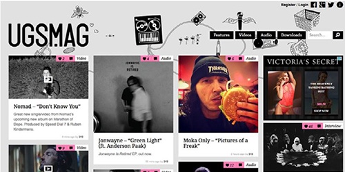
Photo Credit: USG MAG
- Masonary or grid format as seen below
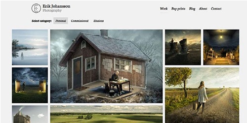
Source: Erik Johansson
- Magazine style that you seen in books can be transfer into the web using Card UI
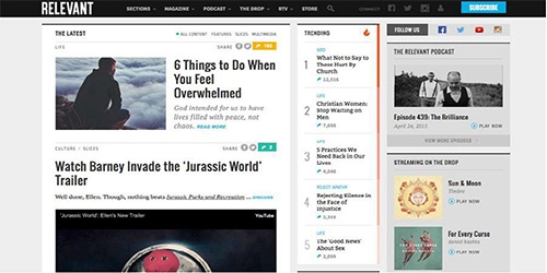
Photo Credit: Relavant Magazine
Now lets look into the pro and cons of using Card UI in our web design right below:
Advantages:
Card tend to be easier to be used by the users as it will provide an intuitive understanding
Suitable for mass content to display such as having multiple sites to show
Easy to browse
They can be share in the world wide web easily
The style of each cards are versatile as they can adapt to any style you need
Disadvantages:
Since this is a popular style, it tends to be used up often and look dull
Interaction of the card to the user is the key factor for its success which requires a heavy creative UX design
May result in cluttered feel if not careful
Visual design is much needed since only limited information can be displayed
Now you know about the good and bad of using card UI, here are some tips for you to get started by Carrie Cousins. Her article, The Complete Guide to an Effective Card-Style Interface Design will outlines the seven essential practices for designing with card.
Avoid cluttering by using the whitespace you have by adding borders and padding
Keep it simple by using a simple concept which is “One card, one concept”, do not make things too complicated.
Since the cards will be small, use simple images which are clear and crop them in relation to where is needed
Similar to images, use simple typography which are simple and elegant so it is more readable for your users.
As stated above, it is a popular design. Hence, get creative with the designs to make it stand out than others.
To maintain enough whitespaces or negative spaces use a standard grid to make sure the same spacing can be applied
Implement Fitts’s Law, as a summary to it will be ensuring your entire card be clickable to enhance user interactivity.
Now you know how to get started on Card UI , is time to apply it to your website!
Source: Web Design Book of Trends 2015-2016, by UXPin
Thumbnail: Designed by Freepik
